
Pan-Asian Restaurant · Brand Identity
Don Chi
A complete visual identity built around modern Pan-Asian cues.
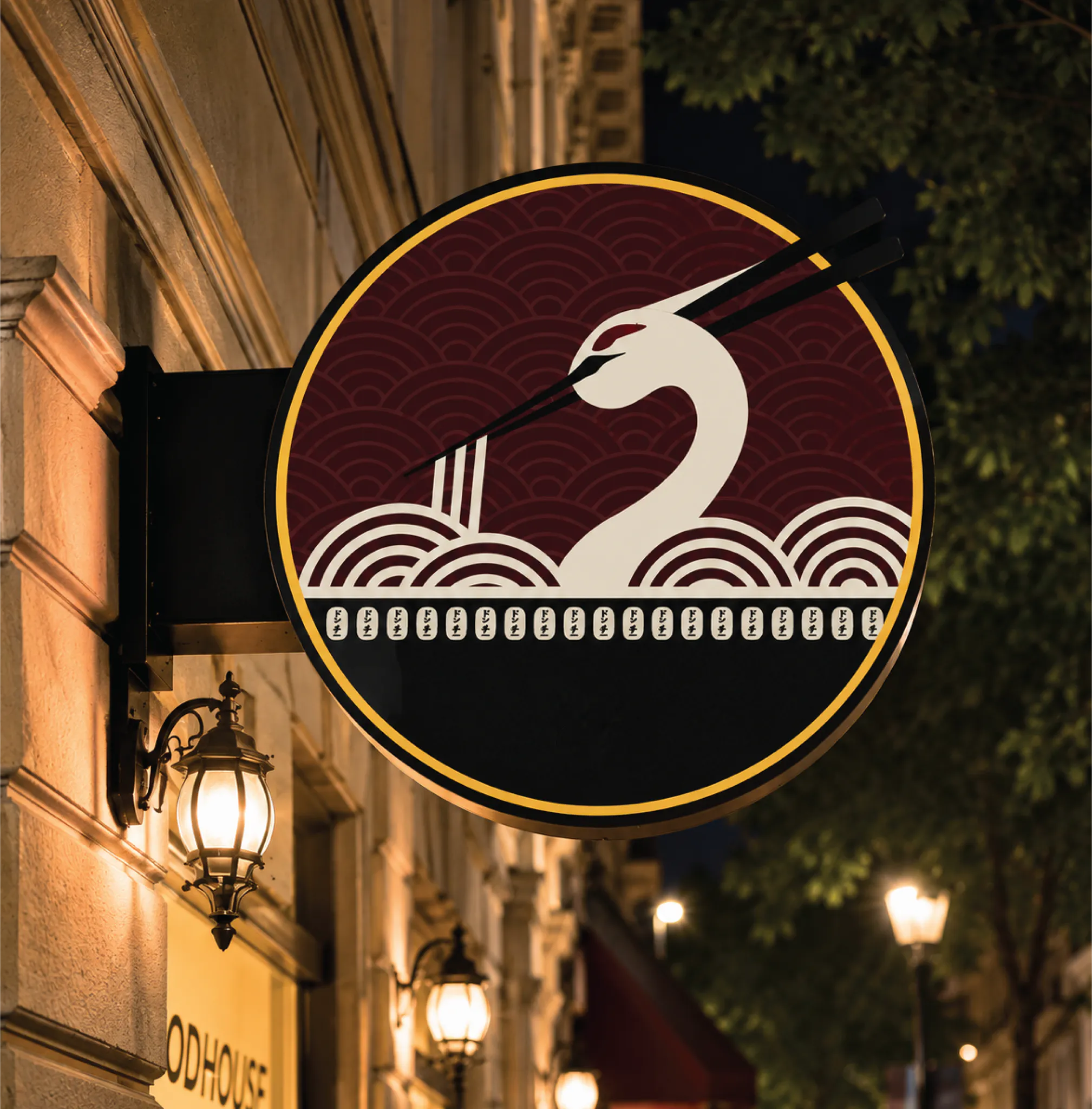



We developed Don Chi’s identity from the ground up, beginning with the wordmark and monogram and exploring visual elements rooted in Pan-Asian culture. The monogram brings together references to a swan, chopsticks, waves and a bowl, creating a distinct mark for the brand.
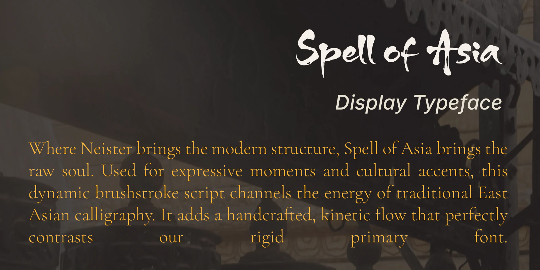
From there, we built the wider identity system — a five-colour palette, display and supporting typography, logo guidelines and visual applications. The colour system moves through vermilion torii, golden bamboo, rice-paper ivory, grove green and sumi ink, while the typography combines geometric display type, expressive brush lettering, refined serif details and a clean functional font.
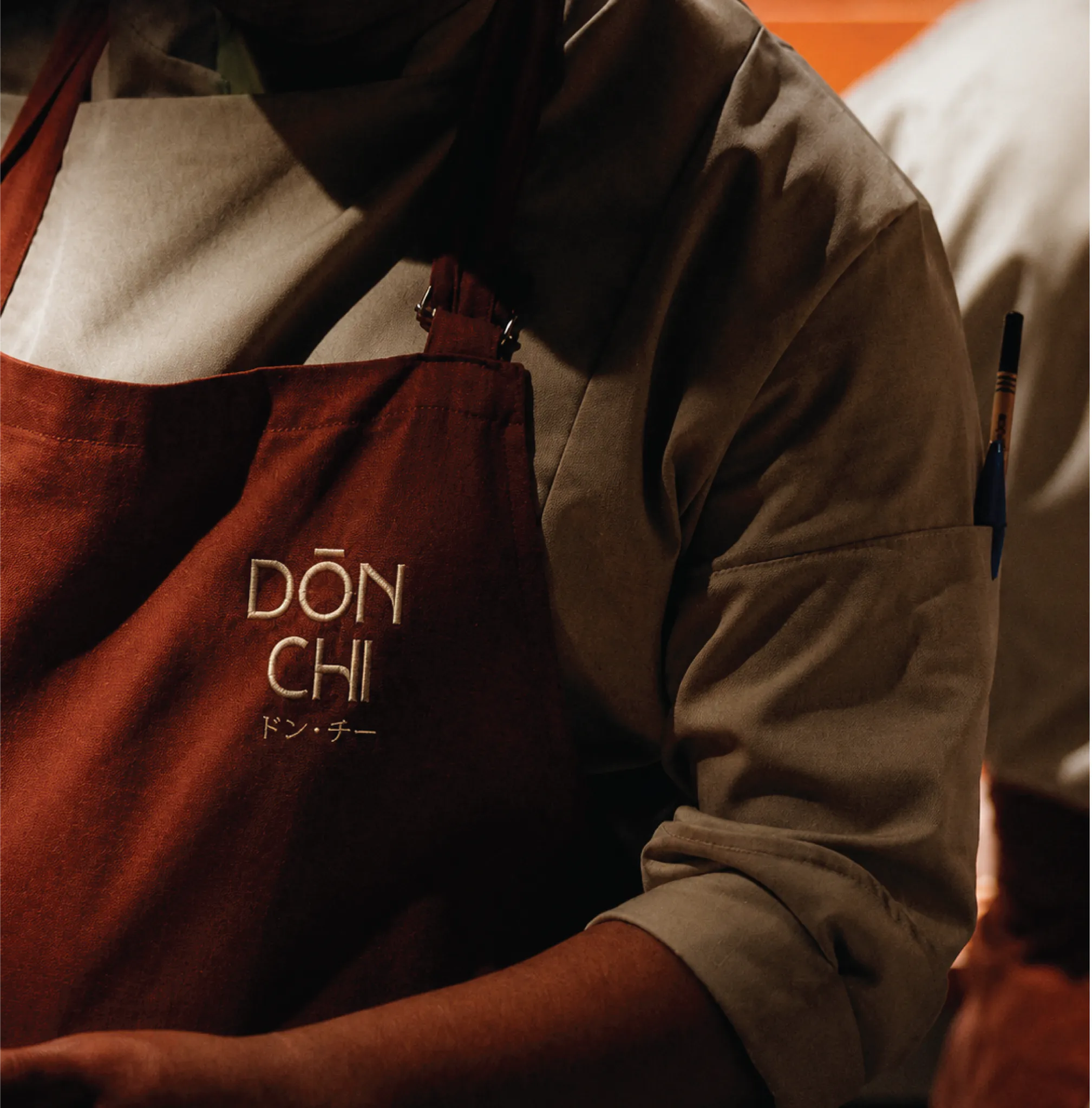
We then extended the identity into physical brand applications, including signage, a brand pattern and staff apparel, creating a consistent visual system for the restaurant before launch.
Like what we did for Don Chi?